Los Angeles Clippers Start Fresh With Complete Rebrand

Image by Forbes
The Los Angeles Clippers and Owner Steve Ballmer have decided to start fresh with a complete rebrand of the Clippers. The rebrand includes a new uniform set, a new court design, and a new team logo.
First, the logos and team colorway:

Image by SportsLogos.net
Previous Clippers’ uniforms have never really captured the true meaning behind the name “Clippers”. Starting in San Diego, the Clippers’ name is a representation of clipper ships and naval vessels off of the coast of San Diego. Back then and even when the team relocated to Los Angeles in 1984, the Clippers faced a true identity issue.
The new logos show respect to the team’s origins by having the clipper ship as the focus of the logo. What also makes the logo very unique is the compass on the outside of the ship, furthering the clipper image. Images such as Secondary A and the Partial logo in the image allow the Clippers to use creativity with different uniform concepts in the future.
In fact, Clippers’ President of Basketball Operations Gillian Zucker was asked by reporters about the potential of the secondary logos, specifically the “LA” secondary A logo. “It will make for a phenomenal hat," Zucker said. "In 20 years, people will look back and this will be iconic for the Clippers."
The colorway will stay somewhat the same as what the Clippers have always done, with a little bit more of a focus on navy blue now. However, now the addition of powder blue in the main logo should lead to the Clippers using powder blue more in uniform combinations, which tends to resonate well with basketball fans.
Now, what everyone wants to see. The uniforms:

Image by ESPN
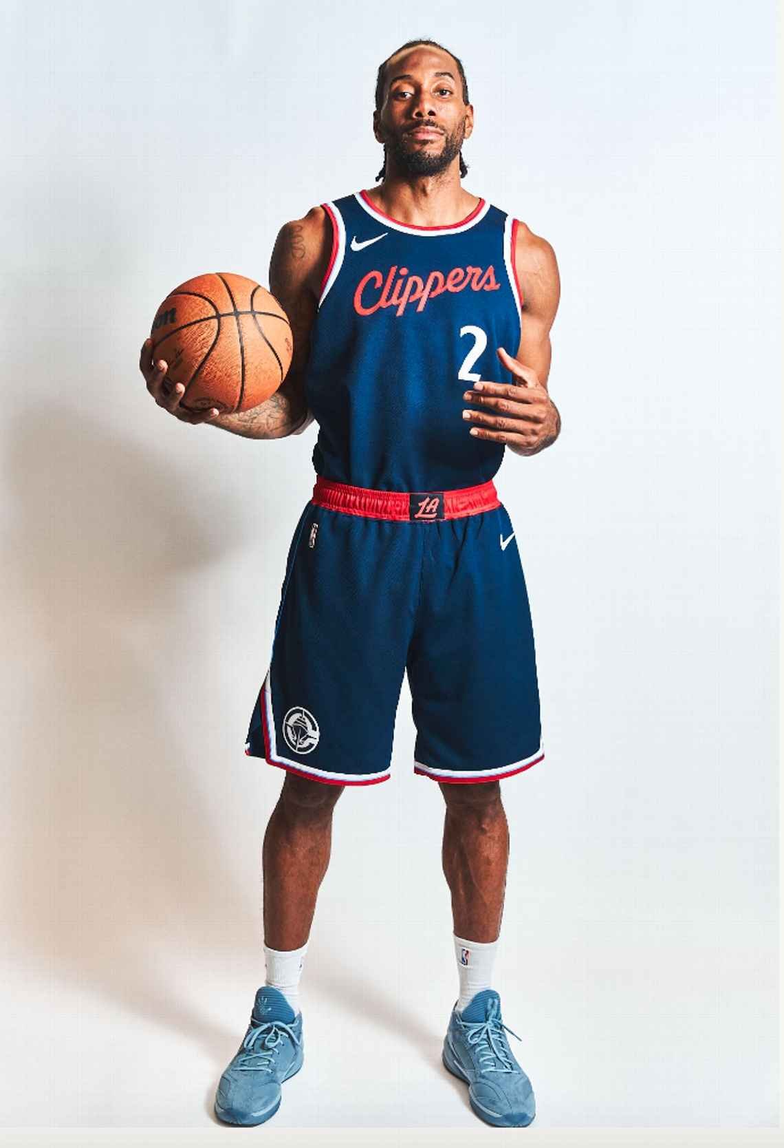
Image by ESPN

Image by ESPN
It’s clear by looking at these uniforms that the Clippers didn’t want to go with anything to flashy. That seems to be the way NBA and basketball uniforms in general have been going lately. Teams like the Cleveland Cavaliers, Houston Rockets, and Utah Jazz have all recently undergone complete rebrands with a focus on simplistic uniform sets. These teams initially receive some backlash for not being super creative, however, in the long run fans generally come around.
These Clippers uniforms are a step-up from true simplicity uniforms as they feature unique fonts, piping, and logo use throughout the uniforms. The red Statement uniform even features side piping that are nautical symbols, spelling out “LAC” for the Los Angeles Clippers.
Zucker commented on some inputs they had from fans about previous uniforms, specifically about the alternate black Clippers’ uniforms they’ve worn the last couple of years. “We kept hearing from people that black was overdone.” When asked about powder blue uniforms, Zucker said “Fans often mentioned their love for that shade”, which hopefully implies that powder blue uniforms will be coming shortly. For now, the only powder blue NBA fans get on this jersey is minimally piping on the white Association jerseys.
Moving onto the new court design:

Image by Sportico
Nothing crazy with colorways on this court design. Seems fairly basic for the NBA with the team’s global logo on the center court, with a small amount of powder blue featured in the media box lines. What does stand out as unique are the coordinates on the bottom of the court. These coordinates will represent the coordinates of future Clippers’ stadium the Inutit Dome, which is scheduled to open next season.
This rebrand will be rolled out next season for the Clippers. Paired with the new Intuit Dome, the Clippers will be looking fresh and brand new for the 2024-2025 NBA season.
"The hope [for the look]," Zucker said, "is that it's modern but feels like it has been around forever."